Understanding Color Psychology
Hello team member. As we scale our custom merchandise operations, grasping consumer behavior is crucial. The visual impact of our products dictates our conversion rates. Implementing strategic Color Psychologyon your POD Brand is not merely an artistic choice; it is a vital sales tactic. When a potential buyer scrolls through our digital storefront, the hues they see instantly trigger subconscious emotional responses. By deliberately choosing specific shades for our core Apparel Design catalog, we can directly influence how customers perceive our brand’s personality, ultimately driving higher engagement and maximizing our daily ecommerce revenue.
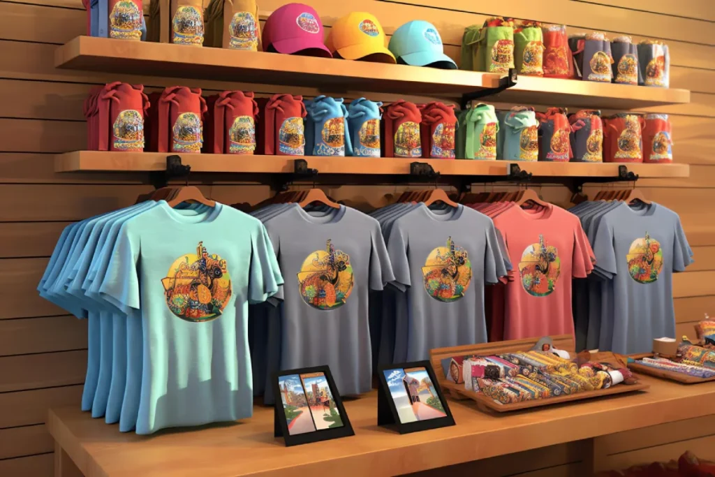
The Power of Warm Hues
Warm shades like red, orange, and yellow naturally grab human attention faster than any other spectrum. Red is universally associated with passion, urgency, and high energy. Utilizing bright red in your Apparel Design is perfect for fitness gear or limited-time promotional items. Yellow evokes feelings of optimism and youthful joy, making it an excellent background choice for humorous or lighthearted graphics. However, you must apply these intense warm tones carefully. Overusing them can easily overwhelm the shopper’s eyes and create visual fatigue, which negatively impacts the overall browsing experience on our website.
Cool Tones in Apparel Design
Conversely, cool shades such as blue, green, and purple produce a calming, highly trustworthy psychological effect. Blue is the most universally favored hue globally, symbolizing reliability and profound security. Incorporating deep navy blues into your Apparel Design works exceptionally well for corporate merchandise or professional lifestyle brands. Green strongly represents nature, health, and sustainable growth, making it the absolute mandatory choice for our eco-friendly clothing lines. Purple carries historical ties to royalty and creative luxury, perfectly elevating the perceived retail value of our premium custom merchandise collections.
Mastering Black and White
Never underestimate the immense psychological power of absolute neutrals. Black is the ultimate staple in modern fashion, representing sleek sophistication, edgy rebellion, and timeless elegance. A heavy reliance on black garments provides a highly premium, exclusive feel to our digital storefront. White, on the other hand, communicates pure simplicity, stark cleanliness, and modern minimalism. Mastering the stark contrast between these two extremes is a fundamental lesson in Color Psychology. Striking, high-contrast black and white graphics remain our most consistent, reliable top-selling items across every single targeted demographic.
Aligning Hues with Your Niche
Context is everything when applying these visual strategies to our daily operations. A specific shade that perfectly works for a heavy metal band will completely fail for a peaceful yoga studio. You must intimately know our target audience before finalizing any new Apparel Design. Research the established visual language of the specific niche community you are targeting. Aligning our physical products with the expected visual norms of that specific passionate group builds immediate brand trust, drastically lowering our customer acquisition costs and ensuring consistent, long-term ecommerce profitability.
Conclusion: Applying Color Psychology
In summary, visual strategy is a powerful sales tool. By comprehensively understanding the subconscious emotional triggers associated with different shades, we can drastically improve our conversion metrics. Deliberately applying Color Psychology allows us to craft targeted, highly persuasive clothing collections. Whether you are utilizing energetic reds for fitness gear or trustworthy blues for corporate clients, intentional Apparel Design always yields superior financial results. Let us continue to test different visual combinations rigorously, analyzing the data to build a dominant, highly profitable online merchandise empire together.
Frequently Asked Questions
1. Does Color Psychology really affect sales?
Yes, visual appearance is the primary factor influencing a consumer’s subconscious purchasing decision online.
2. What is the safest shade for new Apparel Design?
Black is universally the safest and highest-selling garment choice across almost every single e-commerce niche.
3. Should I use many hues in one design?
No, limiting your palette to two or three complementary shades ensures a cleaner, more professional final product.
4. How do I know which shade fits my niche?
Research your top competitors and observe the dominant palettes they successfully use to attract their specific audiences.
5. Can Color Psychology change based on culture?
Absolutely, different global cultures associate entirely different emotional meanings with specific visual shades and combinations.